
The Introvert’s Guide to Building a Personal Brand That Feels Aligned
Discover how to build an authentic introvert personal brand without compromising your need for solitude. Learn from history’s quiet changemakers and get actionable tips to create a lasting impact while staying true to yourself.
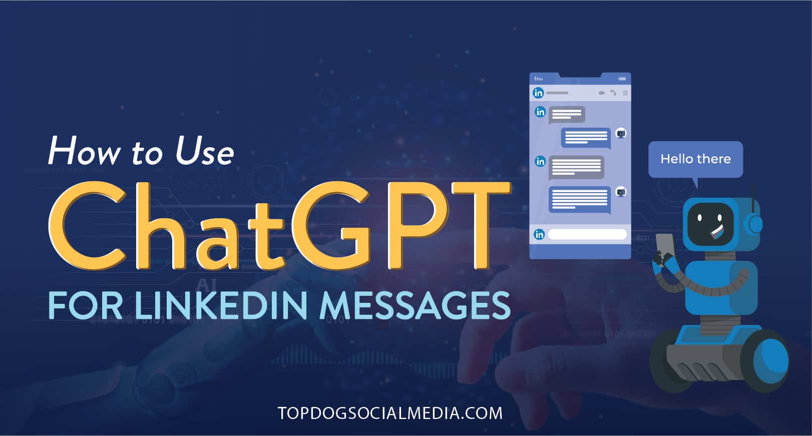
How to Use ChatGPT for LinkedIn Messages
Boost your lead generation by leveraging ChatGPT for LinkedIn messages and create personalized, engaging messages that stand out.

Melonie Dodaro • LinkedIn
Decoding the Latest LinkedIn Algorithm Changes: What’s Hot, What’s Not
Stay updated with the latest LinkedIn algorithm changes and discover how to gain more visibility. Discover the driving force behind these changes and gain insights into what’s working and what’s not.
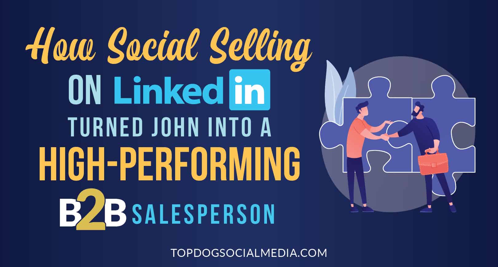
How Social Selling on LinkedIn Turned John into a High-Performing B2B Salesperson
Learn how John discovered the world of social selling on LinkedIn to boost his B2B sales success. Tips and strategies included.
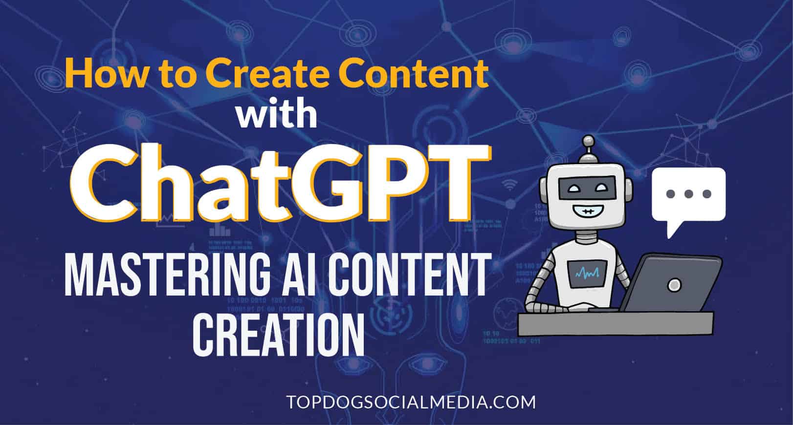
How to Create Content with ChatGPT: Mastering AI Content Creation
Discover the potential of AI in content creation and learn how to create content with ChatGPT using this comprehensive step-by-step guide.

The Power of Social Selling on LinkedIn: How to Boost Your Sales and Build Your Personal Brand
Learn how to use LinkedIn for sales with this comprehensive guide. Discover strategies for social selling on LinkedIn, nurturing relationships, and measuring your success.


